
TRANSFORMATION
What you'll first notice about a BEFORE-AFTER comparison is the LOOK--- cleaner, clearer, more professional image, more attractive.
But what is behind 'pretty design,' must be a story and strategy that drives the visual. The best presentations communicate both information and image.
We banish visuals that are wordy, uninspired, and compete against you...and instead, create images that command attention and retention, clarify and eluciate, and eliminate unnecessary and distracting jumble.
In short, your visuals need to be as smart as you are.
AND REMEMBER. MANY OF THESE SLIDES MUST BUILD ONE ELEMENT AT A TIME---NOT ALL-AT-ONCE. THIS KEEPS THE PRESENTER IN CONTROL---AND KEEPS THE AUDIENCE FROM READING RATHER THAN PAYING ATTENTION TO THE PRESENTER.
A TINY FEW EXAMPLES
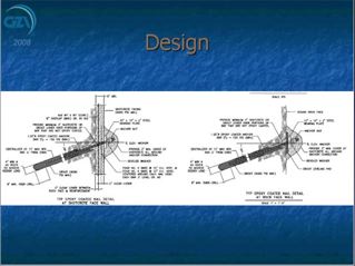
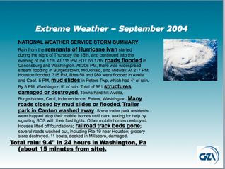
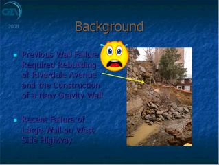
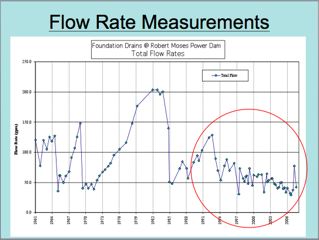
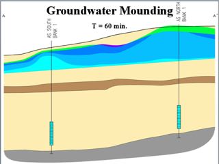
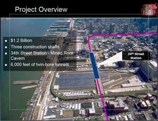
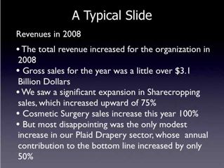
| We helped transform the way GZA looked at its visuals. Like most technical/engineering firms, it operated for years believing a slide must include everything. They discovered concepts are more meaningful when a presentation is about the CONSEQUENCES of data---how that data affects the audience, not just data in its unvarnished form. Simplicity most often provides greater detail than complexity. | |||||
| From | |||||
 |
 |
 |
 |
||
| To | |||||
 |
 |
 |
 |
||
|
|
|||||
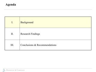
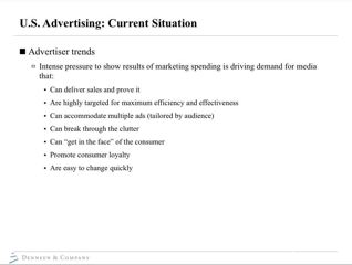
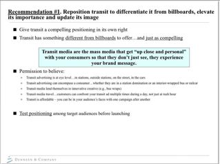
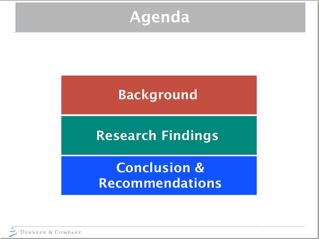
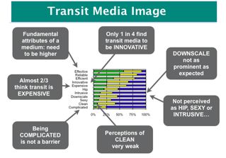
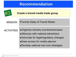
| DENNEEN AND COMPANY is a world class management consulting firm. Like many, their talks were rich with valuable information. But like many organizations, their visuals were often word-based documents that forced audiences to read rather than listen. |
|||||
| From | |||||
 |
 |
 |
|||
| To | |||||
 |
 |
 |
|||
|
|
|||||
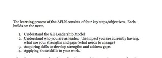
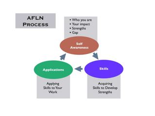
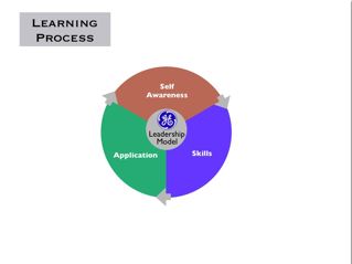
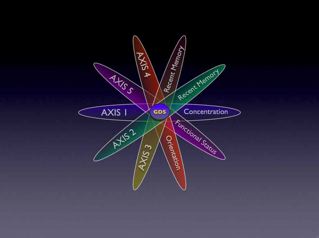
| CHOICEPOINT CONSULTING developed a Leadership Model for GE. They needed a graphic representation, to convey the stages and inter-relationships of components. | |||||
| From | |||||
 |
|||||
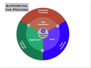
| To | |||||
 |
 |
 |
|||
|
|
|||||
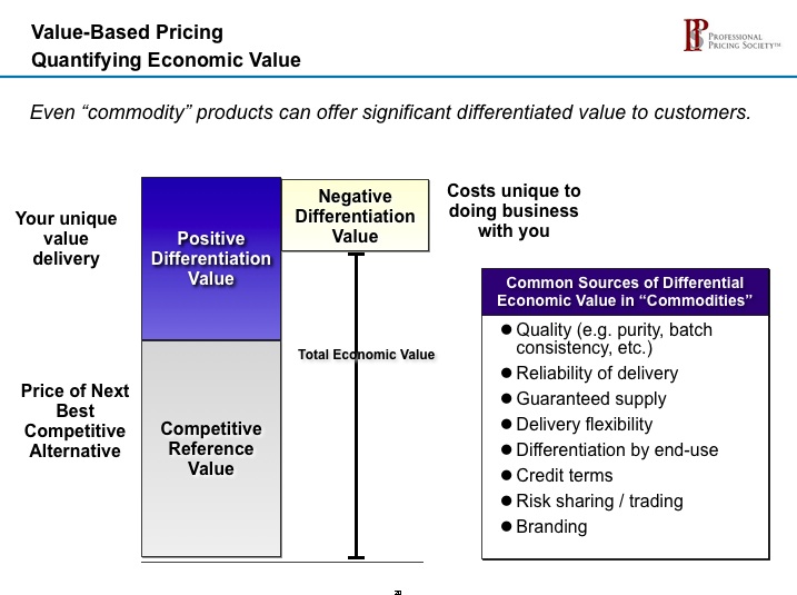
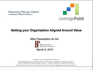
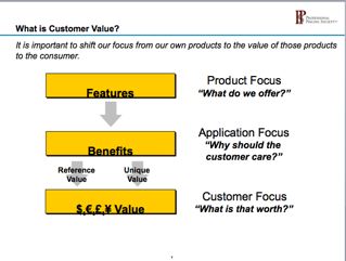
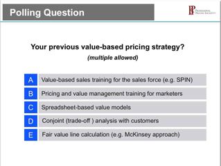
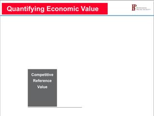
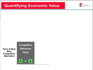
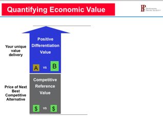
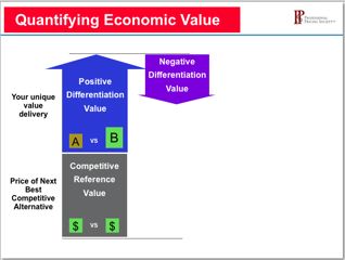
| LEVERAGEPOINT, a corporate offspring of MONITOR GROUP, is a worldwide leader in value strategy. | |||||
| From | |||||
 |
 |
|
 |
||
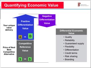
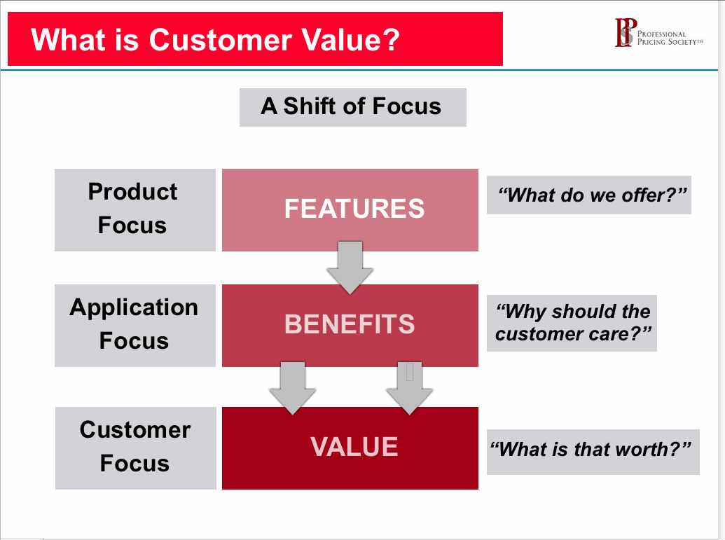
| To | |||||
 |
 |
 |
 |
||
|
|
|||||
| MEMORABLE IMAGES RATHER THAN WORDS | |||||
| Two appraches to content. A text-based description, on the left as we typically see, or a clear and retention-triggering visual representation. It doesn't take too much longer to create the one on the right. | |||||
 |
|||||
| Well designed visuals are remembered. | |||||
 |
 |
 |
 |
||
|
|
|||||
| JUST PLAIN GOOD EXAMPLES | |||||
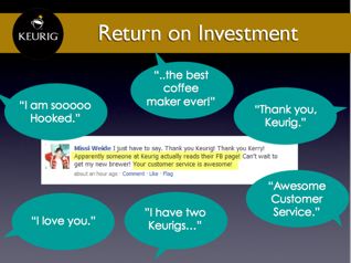
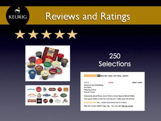
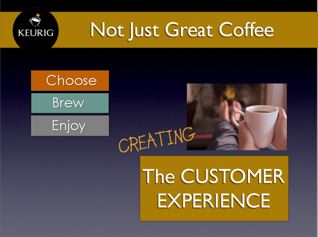
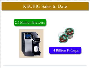
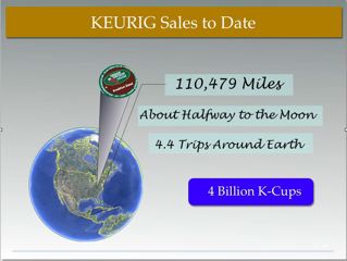
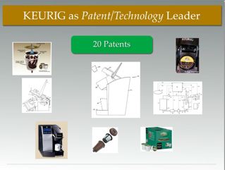
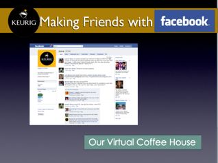
| Keurig, the planet's fastest growing coffee company created a pitch to expland its markets and convey its innovative marketing approach. | |||||
 |
 |
 |
|||
 |
 |
 |
 |
||
 |
|||||
|
|
|||||
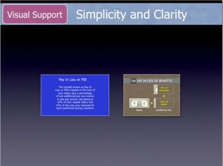
| DON'T CONFUSE SLIDES AND HANDOUTS | |||||
| Slides should be simple. Supportive. Key words. With compelling and clarifying images. Handouts, on the otgher hand, can be robust and detailed. Most presentations falter when one tool tries to do both. | |||||
| Slides=Simple | 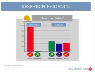 |
 |
Handouts=Detailed | ||
|
|
|||||
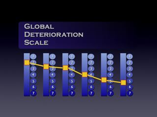
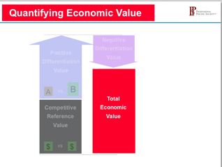
| BUILD YOUR STORY RATHER THAN AVALANCE ALL-AT-ONCE | |||||
| Building one element at a time, as in this LEVERAGEPOINT presentation, introduces content "just-in-time." A complex model can be introduced in digestible, point-at-a-time chunk. And the presenter stays in control. | |||||
 |
 |
 |
 |
||
 |
|
 |
|||
| JUST A FEW PRINCIPLES THAT GUIDE EVERY BEFORE-AFTER | |||||
| 1. SIMPLIFY | |||||
| 2. OUT, YE JUMBLE AND CLUTTER | |||||
| 3. FIND ALTERNATIVES TO WORDS | |||||
| 4. VISUALS MUST SUPPORT, NOT COMPETE | |||||
| 5. VISUALS MUST REFLECT YOUR IMAGE | |||||
| 5. WE MUST BE STORYTELLERS, NOT LISTMAKERS | |||||